T1, MTR and MTsat in-vivo
3 healthy participants were scanned with the following MTsat protocol:
Click here to reveal the MTsat protocol.
Parameter (PDw/MTw/T1w) |
G1NATIVE |
S1NATIVE |
S2NATIVE |
VENUS |
|---|---|---|---|---|
Sequence Name |
SPGR |
FLASH |
FLASH |
mt_sat v1.0 |
Flip Angle (°) |
6/6/20 |
6/6/20 |
6/6/20 |
6/6/20 |
TR (ms) |
32/32/18 |
32/32/18 |
32/32/18 |
32/32/18 |
TE (ms) |
4 |
4 |
4 |
4 |
FOV (cm) |
25.6 |
25.6 |
25.6 |
25.6 |
Acquisition Matrix |
256x256 |
256x256 |
256x256 |
256x256 |
Receiver BW (kHz) |
62.5 |
62.5 |
62.5 |
62.5 |
RF Phase Increment (°) |
115.4 |
50 |
50 |
117 |
MT Pulse |
off/on/off |
off/on/off |
off/on/off |
off/on/off |
MT Pulse Duration (ms) |
8 |
10 |
10 |
12 |
MT Pulse Shape |
Fermi |
Gaussian |
Gaussian |
Fermi |
MT Pulse Offset (Hz) |
1200 |
1200 |
1200 |
1200 |
The following code cell loads all the necessary Python packages, defines common functions and downloads the data to /tmp/VENUS directory. If data already exists, the download will be skipped.
The number of data points per kernel-density estimations (KDE) were limited to 10k for faster visualization. Lower and upper limits of the distributions are set according to the original publication.
Tip
You can use the legend on the right to display a selection of KDEs. For example, double click on G1VENUS to single out vendor-neutral distributions acquired on the GE scanner.
At the top right corner of the plot background, you can switch the hover mode to
compare data on hoverto compare KDEs point by point.
import plotly.graph_objs as go
import plotly.express as px
from plotly import tools, subplots
import numpy as np
import pandas as pd
import ipywidgets as widgets
import math
from plotly.offline import download_plotlyjs, init_notebook_mode, plot, iplot
from ipywidgets import interact, interactive, fixed, interact_manual
from IPython.core.display import display, HTML
init_notebook_mode(connected=True)
import scipy.io as sio
import random
random.seed(123)
from plotly.subplots import make_subplots
from repo2data.repo2data import Repo2Data
import os
data_req_path = os.path.join("..", "binder", "data_requirement.json")
repo2data = Repo2Data(data_req_path)
data_path = repo2data.install()[0]
derivativesDir = os.path.join(data_path,"qMRFlow")
sessions = ['vendor750rev','vendorPRIrev','vendorSKYrev',
'rth750rev','rthPRIrev','rthSKYrev']
sides = ["negative","negative","negative","positive","positive","positive"]
pointpos = [0,0,-0.14,0.14,0,0]
convert_tag = {'rth750':'G1<sub>VENUS</sub>','rthPRI':'S1<sub>VENUS</sub>','rthSKY':'S2<sub>VENUS</sub>',
'vendor750':'G1<sub>NATIVE</sub>','vendorPRI':'S1<sub>NATIVE</sub>','vendorSKY':'S2<sub>NATIVE</sub>'}
colors = {'rth750':'rgba(255,8,30,1)','rthPRI':'rgba(255,117,0,1)','rthSKY':'rgba(255,220,0,1)',
'vendor750':'rgba(0,75,255,1)','vendorPRI':'rgba(24,231,234,1)','vendorSKY':'rgba(24,234,141,1)'}
colors_line = {'rth750':'rgba(255,8,30,0.35)','rthPRI':'rgba(255,117,0,0.35)','rthSKY':'rgba(255,220,0,0.35)',
'vendor750':'rgba(0,75,255,0.35)','vendorPRI':'rgba(24,231,234,0.35)','vendorSKY':'rgba(24,234,141,0.35)'}
def plot_ridgelines(subject,sessions,metric,region,colors,sides,sampN,leg,lowlim,uplim):
df = pd.DataFrame()
traces = []
for jj in range(0,len(sessions),1):
avg_array = []
std_array = []
cur_region = derivativesDir + '/sub-' + subject + '/ses-' + sessions[jj] + '/stat/sub-' + subject + '_ses-' + sessions[jj] + '_desc-' + region + '_metrics.mat'
cur_contents = sio.loadmat(cur_region)
cur_contents = cur_contents[metric]
cur_contents = np.delete(cur_contents, np.where(cur_contents < lowlim))
cur_contents = np.delete(cur_contents, np.where(cur_contents > uplim))
cur_tag = sessions[jj][0:-3]
cur_contents = random.sample(list(cur_contents),sampN)
traces.append(go.Violin(
x=cur_contents,
name = convert_tag[cur_tag],
marker=dict(
opacity = 0.7,
outliercolor='rgba(255, 255, 255, 0.6)',
line=dict(
outliercolor='rgba(219, 64, 82, 0.6)',
outlierwidth=2)),
line_color= colors[cur_tag],
legendgroup= convert_tag[cur_tag],
showlegend=leg,
side=sides[jj],
pointpos = pointpos[jj]))
return traces
def plot_mosaic(metric,axis_title,lowlim,uplim):
nSamp = 10000
traces1 = plot_ridgelines('invivo1',sessions,metric,'wm',colors,sides,nSamp,True,lowlim,uplim)
traces2 = plot_ridgelines('invivo1',sessions,metric,'gm',colors,sides,nSamp,False,lowlim,uplim)
traces3 = plot_ridgelines('invivo2',sessions,metric,'wm',colors,sides,nSamp,False,lowlim,uplim)
traces4 = plot_ridgelines('invivo2',sessions,metric,'gm',colors,sides,nSamp,False,lowlim,uplim)
traces5 = plot_ridgelines('invivo3',sessions,metric,'wm',colors,sides,nSamp,False,lowlim,uplim)
traces6 = plot_ridgelines('invivo3',sessions,metric,'gm',colors,sides,nSamp,False,lowlim,uplim)
fig = make_subplots(rows=3, cols=2,
subplot_titles=("P1 White Matter", "P1 Gray Matter", "P2 White Matter", "P2 Gray Matter", "P3 White Matter", "P3 Gray Matter"),
vertical_spacing = 0.08,
shared_xaxes=True)
for trace in traces1:
fig.add_trace(trace,row=1, col=1)
for trace in traces2:
fig.add_trace(trace,row=1, col=2)
for trace in traces3:
fig.add_trace(trace,row=2, col=1)
for trace in traces4:
fig.add_trace(trace,row=2, col=2)
for trace in traces5:
fig.add_trace(trace,row=3, col=1)
for trace in traces6:
fig.add_trace(trace,row=3, col=2)
axis_template = dict(linecolor = 'white',
showticklabels = True,
tickfont=dict(color="white",size=12),
gridcolor = 'rgba(255,255,255,0.2)')
fig.update_yaxes(axis_template,showgrid=False)
fig.update_traces(orientation='h')
fig.update_layout(paper_bgcolor = '#1c2a3d',plot_bgcolor = '#1c2a3d')
fig.update_traces(meanline=dict(visible=True,color="white",width=3),
points= 'outliers', # show all points
jitter=0.1,
width=3) # add some jitter on points for better visibility
#scalemode='count')
fig.update_xaxes(axis_template)
fig.update_layout(width=800,height=950,title=f"VENUS vs NATIVE in-vivo {metric} distributions for each participant (P)", title_font_color="white")
fig.update_annotations(font=dict(color="white", family = "Courier"))
for i in range(1,7):
fig['layout']['xaxis{}'.format(i)]['title']= axis_title
fig.for_each_xaxis(lambda axis: axis.title.update(font=dict(color = 'white', size=12,family="Courier"),standoff=0))
fig.update_layout(
legend=dict(
y = 0.5,
font=dict(
family="Courier",
size=16,
color="white")))
return fig
import warnings
warnings.filterwarnings('ignore')
---- repo2data starting ----
/Users/agah/opt/anaconda3/envs/jbnew/lib/python3.6/site-packages/repo2data
Config from file :
../binder/data_requirement.json
Destination:
/tmp/VENUS
Info : /tmp/VENUS already downloaded
VENUS vs NATIVE T1 distributions
Note
Reproduces Figure 5d-g from the article for the Participant-3.
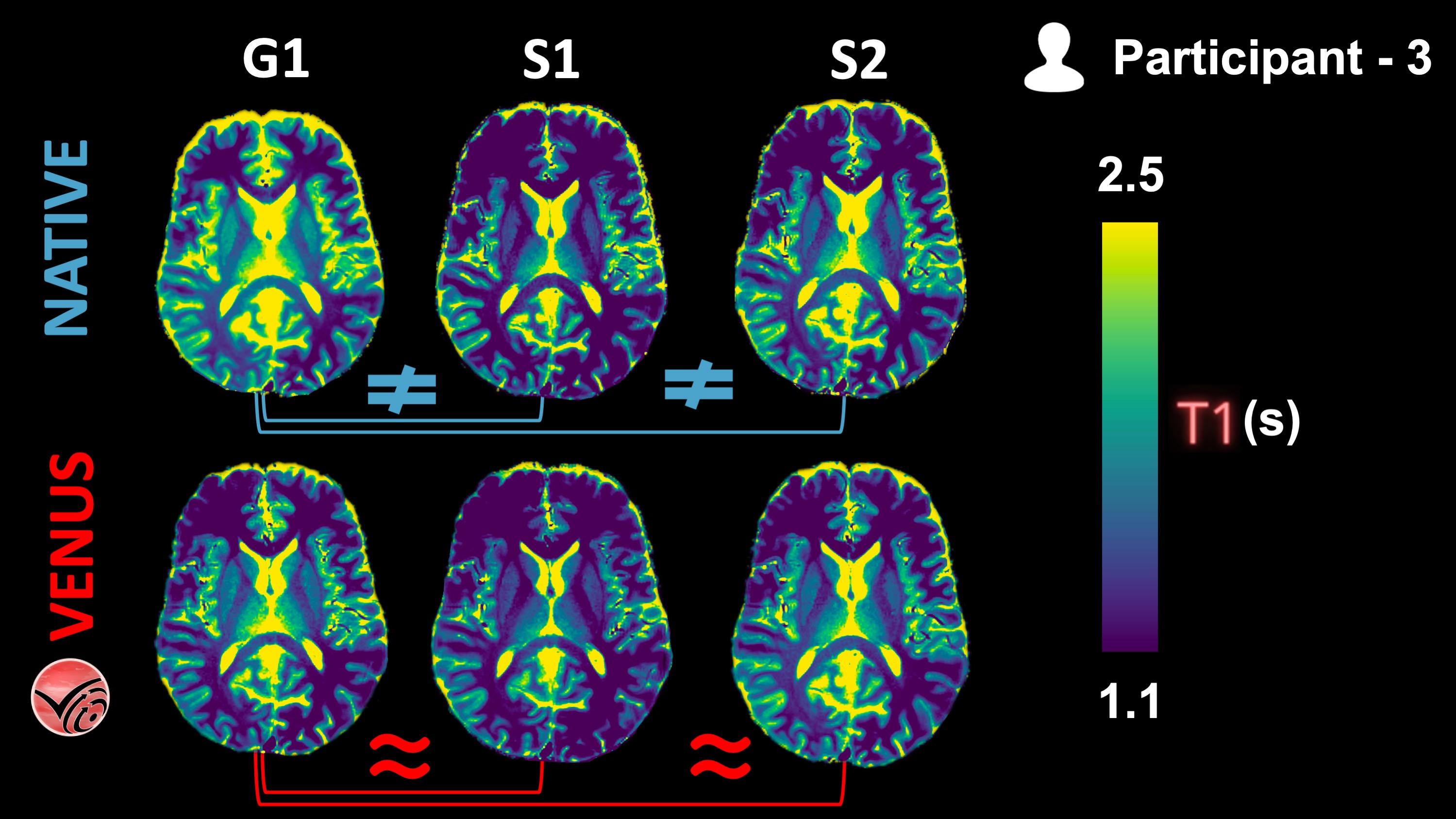
Fig. 1 vendor-native and VENUS quantitative T1 maps from P3 are shown in one axial slice.
The following KDEs agree well with the qualitative observations from the Fig. 1 above: Inter-vendor agreement (G1-vs-S1 and G1-vs-S2) of VENUS is superior to that of vendor-native T1 maps, both in the GM and WM.
fig = plot_mosaic('T1','T1 (s)',0.5,3)
fig.show()
VENUS vs NATIVE MTR distributions
Note
Reproduces Figure 5e-h from the article for the Participant-3.
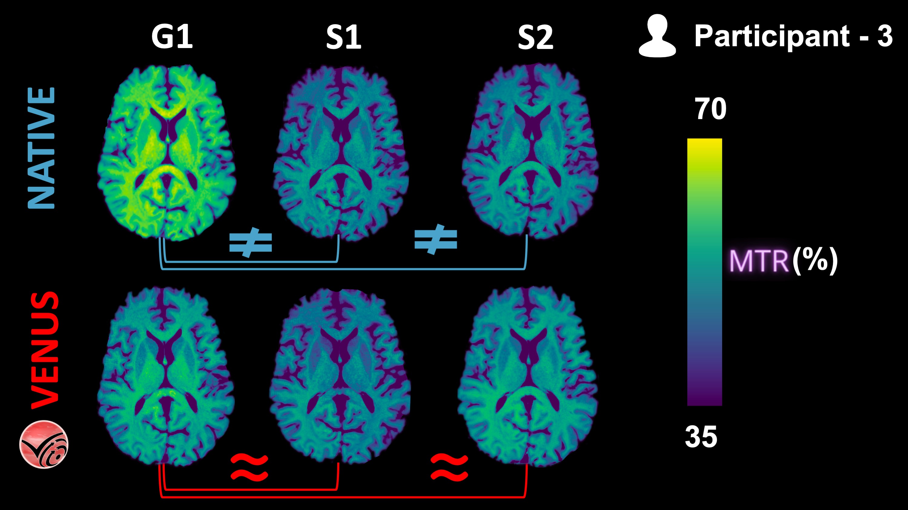
Fig. 2 nendor-native and VENUS quantitative MTR maps from P3 are shown in one axial slice.
The following KDEs agree well with the qualitative observations from the Fig. 2 above: Inter-vendor agreement (G1-vs-S1 and G1-vs-S2) of VENUS is superior to that of vendor-native MTR maps, both in the GM and WM.
fig = plot_mosaic('MTR','MTR (%)',35,70)
fig.show()
VENUS vs NATIVE MTsat distributions
Note
Reproduces Figure 5f-i from the article for the Participant-3.
Fig. 3 vendor-native and VENUS quantitative MTsat maps from P3 are shown in one axial slice.
The following KDEs agree well with the qualitative observations from the Fig. 3 above: Inter-vendor agreement (G1-vs-S1 and G1-vs-S2) of VENUS is superior to that of vendor-native MTsat maps, both in the GM and WM.
fig = plot_mosaic('MTsat','MTsat (a.u.)',0.5,5)
fig.show()
Deciles and shift function
Note
Reproduces Figure 6a from the article.
Before moving on to the next page that performs shift function (for P3) and hierarchical shift function analyses (across participants) in R, this subsection provides some background information about these statistical tests.
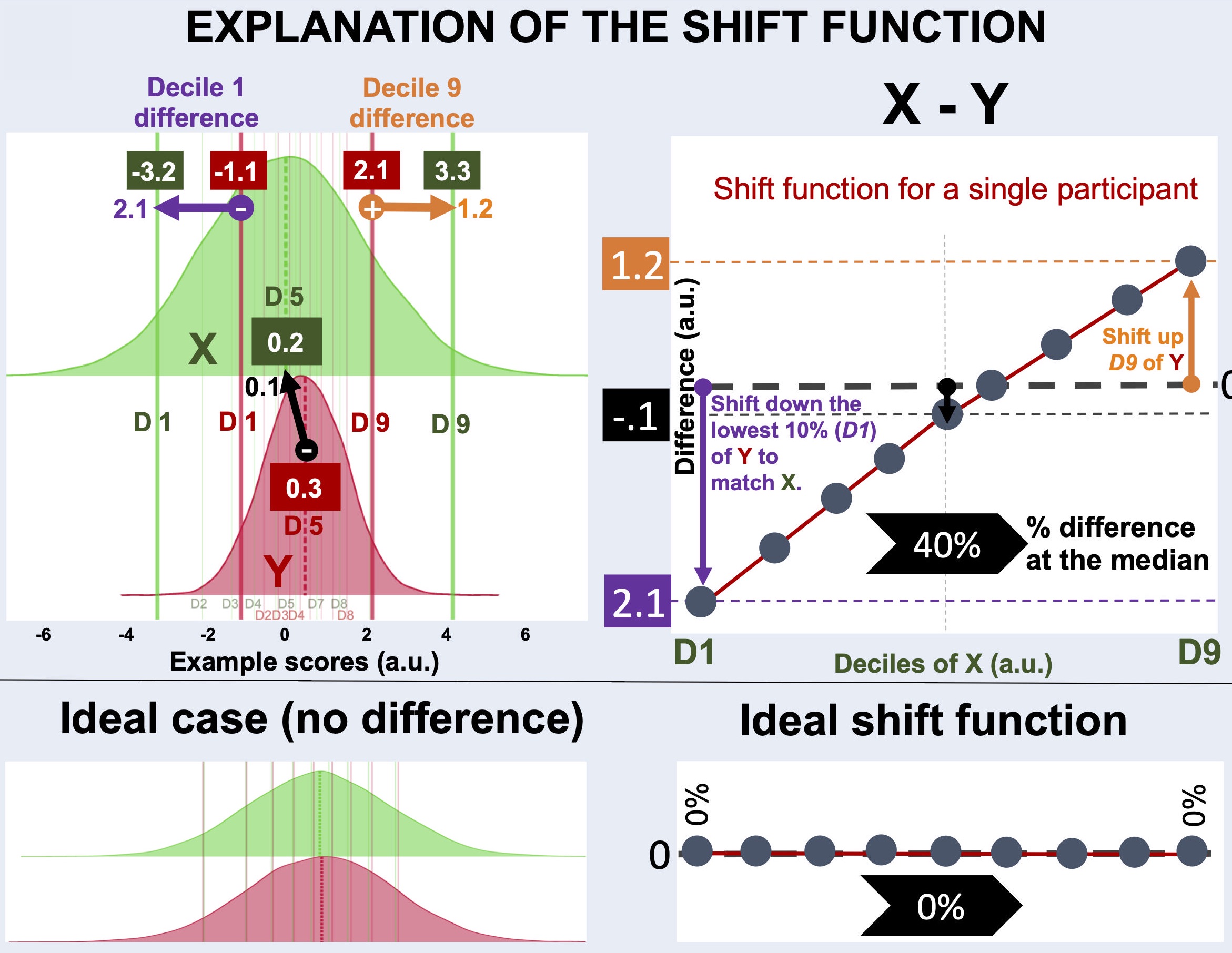
Fig. 4 explanation of the shift function analysis.
What is a decile?
Deciles (a.k.a quantiles) are 1/10th of a distribution, created by splitting the distribution at 9 boundary points (excluding the min and max). For example, median is the 5th decile of a distribution.
How do deciles create a shift function?
To characterize differences between two distributions not only at one decile (e.g., the median), but throughout the whole range of the distributions, shift functions calculate differences at each decile.
For example, distributions X (green) and Y (red) below do not differ much at the central tendency, marked by the dashed lines. The distribution Y is slightly higher than X at the central decile.
On the other hand, distributions X and Y differ in spread. The distribution X is much wider than the distribution Y. As a result:
The first decile of
X(green vertical line on the left) is smaller than that ofY(red vertical line on the left)The last decile of
X(green vertical line on the right) is greater than that ofY(red vertical line on the right)
The profile of shift function calculated for X - Y explains how the deciles of distribution X should be shifted to match those of the distribution Y:
The first decile of
Y(D1) must be shifted towards left (towards lower values) to match that ofXThe first decile of
Ymust be shifted towards right (towards higher values) to match that ofX
Therefore, the first decile on Fig. 4 is below and the last decile is above the zero-crossing.
See Also
For a more detailed explanation on shift functions, please see this blog post by Guillaume A. Rousselet.
from scipy.stats import norm
# generate random numbers from N(0,1)
fig = go.Figure()
data_normal = norm.rvs(size=10000,loc=0.5,scale=1)
data_normal2 = norm.rvs(size=10000,loc=0,scale=2)
# Figure for ideal case
#data_normal = norm.rvs(size=10000,loc=0,scale=1)
#data_normal2 = norm.rvs(size=10000,loc=0,scale=1)
fig.add_trace(go.Violin(x=data_normal,
opacity = 1,
line_color= "crimson",
side="positive",
name = "Y",
meanline=dict(visible=True,color="crimson",width=4),
width=2
))
fig.add_trace(go.Violin(x=data_normal2,
marker=dict(
opacity = 0.3,
outliercolor='rgba(255, 255, 255, 0.6)',
line=dict(
outliercolor='rgba(219, 64, 82, 0.6)',
outlierwidth=2)),
line_color= "limegreen",
side="positive",
name = "X",
meanline=dict(visible=True,color="limegreen",width=4),
width=2
))
fig.update_traces(orientation='h')
fig.update_layout(paper_bgcolor = 'white',plot_bgcolor = 'white',height=600, width=800)
fig.update_traces(points=False)
qs = pd.qcut(data_normal2, 10, labels=False)
aa = []
for ii in range(10):
aa.append(np.median(data_normal2[qs==ii]))
fig.add_vrect(
x0=aa[9] + 0.8, x1=aa[9]+0.9,
fillcolor="limegreen", opacity=0.7,
layer="above", line_width=0,
)
for ii in range(0,9,1):
fig.add_vrect(
x0=aa[ii], x1=aa[ii] + 0.02,
fillcolor="limegreen", opacity=0.3,
layer="above", line_width=0)
fig.add_vrect(
x0=aa[0], x1=aa[0] + 0.1,
fillcolor="limegreen", opacity=0.7,
layer="above", line_width=0,
)
qs = pd.qcut(data_normal, 10, labels=False)
aa = []
for ii in range(10):
aa.append(np.median(data_normal[qs==ii]))
fig.add_vrect(
x0=aa[9], x1=aa[9]+0.1,
fillcolor="crimson", opacity=0.7,
layer="above", line_width=0,
)
fig.add_vrect(
x0=aa[0], x1=aa[0]+0.1,
fillcolor="crimson", opacity=0.7,
layer="above", line_width=0,
)
for ii in range(0,9,1):
fig.add_vrect(
x0=aa[ii], x1=aa[ii] + 0.02,
fillcolor="crimson", opacity=0.3,
layer="above", line_width=0)
fig.add_annotation(x=aa[0], y=0.8,
text="<b><-- D1</b>",
showarrow=False,
yshift=10)
fig.add_annotation(x=aa[-1], y=0.8,
text="<b>D9--></b>",
showarrow=False,
yshift=10)
fig.show()
What about hierarchical shift functions?
Hierarchical shift function (HSF) is an extension of the shift function analysis for the comparison of dependent distributions across multiple participants.
In our case, each between-scanner comparison comes from a repeated measurement, given that the same participants were scanned using different scanners and pulse sequence implementations.
See Also
For a more detailed explanation on shift functions, please see this blog post by Guillaume A. Rousselet.